Flowering Fertility Support
Flowering Fertility Support rebranded from ‘Flowering with Clare’ In early 2024. Flowering provides fertility support services to help individuals and families navigate the emotional challenges of their parenthood journey. The company offers one-on-one consultations and healing services tailored to new parents and those exploring various fertility paths.
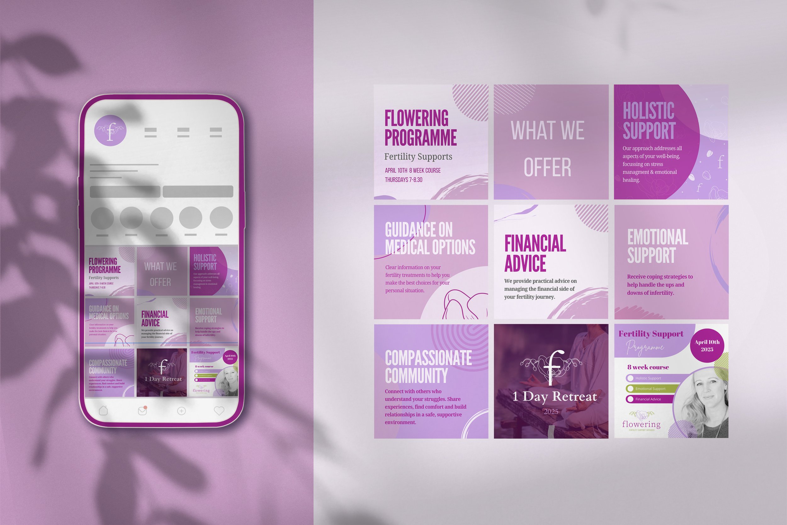
This project was a full rebrand. This rebrand transformed a DIY, homegrown identity into a polished, cohesive brand experience. The client wanted something that still felt soft and organic — but elevated, intentional, and rooted in femininity. We developed a refined visual system that brought consistency and elegance to every touchpoint, while preserving the heart of what made the brand personal and approachable in the first place.

-
Working with Gill of Rebel + Render has been an absolute gift. Gill completely understood the heart and soul behind Flowering Fertility Support – and helped us bring it to life in the most beautiful and authentic way. From rebranding our entire visual identity to designing our new logo, and building a stunning, user-friendly landing page, Gill has played an integral role in helping us establish a strong, heartfelt presence both online and offline. Gill brought so much more than design skills – she brought compassion, creativity, patience, and a deep understanding of the sensitivity of our work. Her ability to translate our vision into visuals that genuinely reflect our mission of supporting people on their path to parenthood is extraordinary. Every detail, from colour palette to layout, was thought through with love and intention. We are so grateful to have had Gill by our side during this transformative phase of our business. She has been a vital member of our team and continues to be a creative force we can count on. We wholeheartedly recommend Gill to anyone looking for thoughtful, soulful, and strategic design that resonates.
Clare - Founder of Flowering Fertility Support
When crafting their brand identity, I wanted to show their passion for When reimagining the identity for Flowering Fertility Support, I wanted the brand to feel deeply symbolic, intuitive, and emotionally grounded — far from clinical or generic wellness aesthetics.
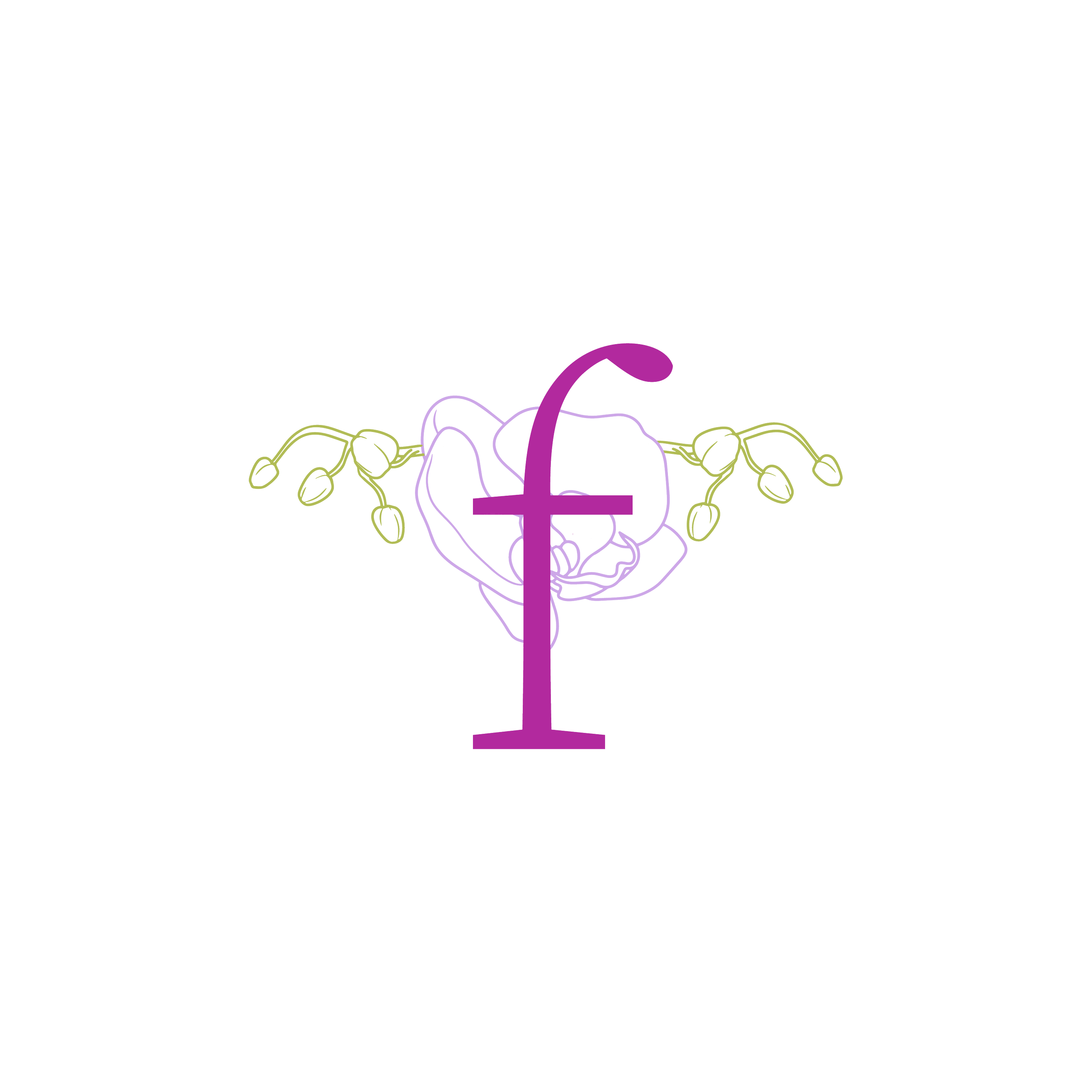
The orchid became a visual metaphor for the brand — its symmetrical petals, soft resilience, and quiet power mirroring the cycles of life, the mystery of the body, and the quiet determination behind every journey toward fertility.
The result: a brand identity that feels refined, organic, and symbolic, honouring both the science and the spirit behind fertility support.
The vision


Logomark


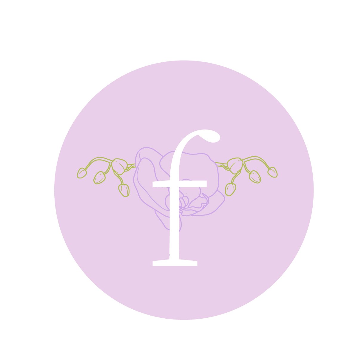
icons


Social Media
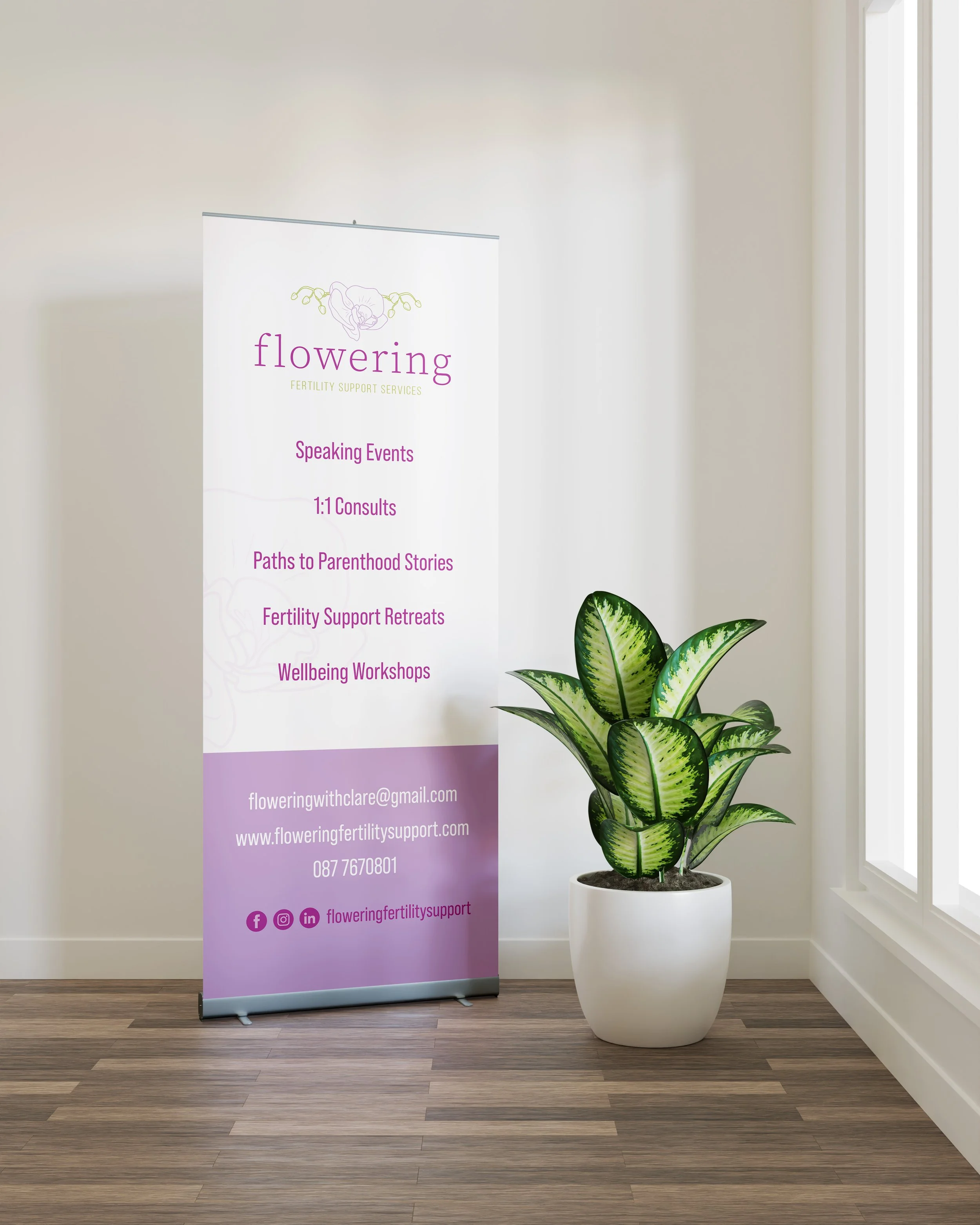
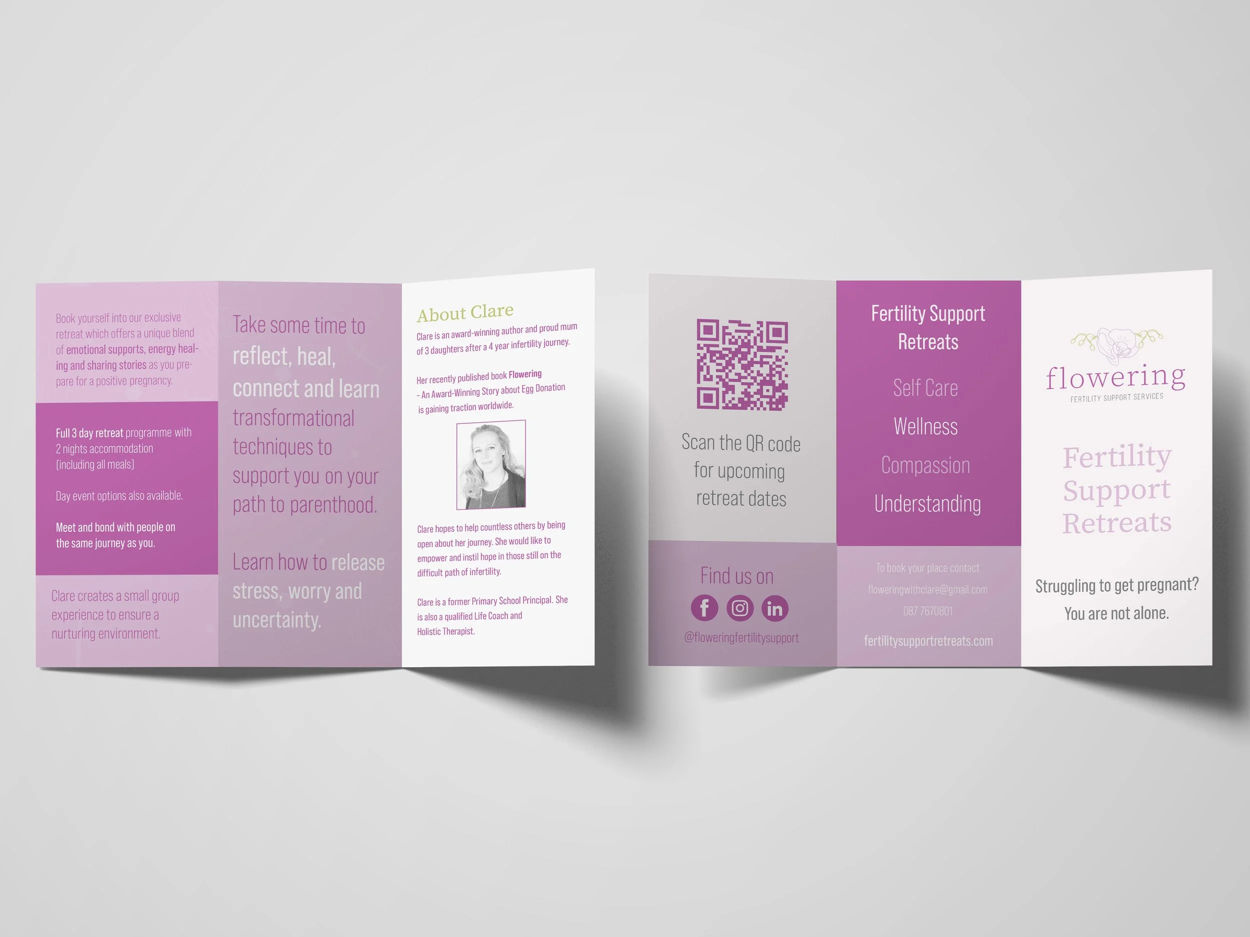
Website

Patterns